Cell Mapping
In this notebook, the actual process of cell mapping will be demonstrated. Please make sure that you have preprocessed the data as per the Preprocessing notebook before running this notebook.
Again, move to the notebooks directory of where you extracted the zip file.
[1]:
import nabo
The Mapping class is mainly responsible for cell mapping. We start by creating a mapping object, which in this case is also called mapping. We pass four parameters to Mapping class, in following strict order:
- Name of the output file, in this case
mapping.h5. - Name of the reference sample (
WThere). This can be anything you like and doesn’t has to match anything used before in this analysis. Please make sure that this name is only composed of alphabetic characters. - Name of the input HDF5 file which contains PCA-reduced data for the reference sample (
hvg_pca_WT.h5). - Group name in the HDF5 file above which contains the data (
data).
[2]:
mapping = nabo.Mapping('../analysis_data/mapping.h5', 'WT',
                       '../analysis_data/hvg_pca_WT.h5', 'data')
Next, we call the set_parameters method to define four parameters in following order:
- Number of PC components to use (
15). - Number of nearest neighbours to be considered (
11). - Distance fraction (
0.25). The ratio of distance to value of target dimension should be smaller than this number. Larger values might lead to a tip effect. - Number of cells to process in a batch (
500). Larger values will consume more RAM.
[3]:
mapping.set_parameters(15, 11, 0.25, 500)
Now we call the make_ref_graph method. This method wraps other functions, which calculate Euclidean distances between reference cells and those which create a shared nearest neighbour graph using these distances. The distances and graph are saved in the output HDF5 file (mapping.h5 here) under group names which follow patterns <ref_name>_dist and <ref_name>_graph, respectively. Since we labeled the reference sample as WT here,
these would be WT_dist and WT_graph.
[4]:
mapping.make_ref_graph()
Now that the reference graph is created (we will visualize it later), the next step is to map target cells onto it. For this we call the map_target method. It is provided three parameters:
- Label/name for target sample.
- Name of input HDF5 file containing PCA data for target sample. Note that it is crucial that cells were transformed into the same PCA space as the reference, as shown in the Preprocessing notebook.
- HDF5 group name where PCA data is located in the file above.
[5]:
mapping.map_target('ME', '../analysis_data/hvg_pca_ME.h5', 'data', overwrite=True)
That marks the end of actual mapping. To visualize the results and perform further analysis we use another class called Graph. We start by creating a Graph instance (conveniently called graph below). Then, we load the reference graph using the load_from_h5 method. This method takes three parameters:
- Name of the input HDF5 file where the graph is stored.
- Name of the sample to be loaded (should be the same as used in the mapping step above)
- Sample type. This can be either ‘reference’ or ‘target’. Please note that the the first sample to be loaded should always be a reference sample.
[6]:
graph = nabo.Graph()
graph.load_from_h5('../analysis_data/mapping.h5', 'WT', 'reference')
To visualize the graph, we first need to calculate the layout. We do this by calling the set_ref_layout method.
[7]:
graph.set_ref_layout()
100%|██████████| 500/500 [00:05<00:00, 96.02it/s]
BarnesHut Approximation  took  2.58  seconds
Repulsion forces  took  2.16  seconds
Gravitational forces  took  0.03  seconds
Attraction forces  took  0.08  seconds
AdjustSpeedAndApplyForces step  took  0.18  seconds
Nabo provides a highly customizable class called GraphPlot for visualizing the graph. The only mandatory parameter is the Graph instance.
[8]:
nabo.GraphPlot(graph)
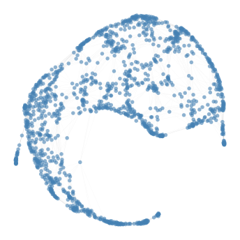
[8]:
GraphPlot of 1414 nodes
This gives us a sense of graph topology. Next, we partition this graph into clusters using the make_leiden_clusters method. You can optimize the number of clusters by checking graph modularity using calc_modularity method. Higher modularity indicates better clustering quality.
[9]:
graph.make_leiden_clusters(resolution=1.0)
[10]:
graph.calc_modularity()
[10]:
0.8476805401424289
We can visualize the cluster on the graph by colouring nodes based on clusters, as shown here:
[11]:
nabo.GraphPlot(graph, vc_attr='cluster', label_attr='cluster')
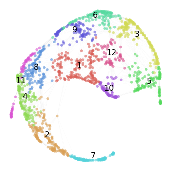
[11]:
GraphPlot of 1414 nodes
Now that we have a good sense of our reference graph, let’s load the mapped target cells onto this graph using the load_from_h5 method.
[12]:
graph.load_from_h5('../analysis_data/mapping.h5', 'ME', 'target')
Visualizing the target cells on the reference layout can produce incomprehensible graph layouts. A better approach is to visualize how many target cells are mapped to each reference cell. This can be obtained using the get_mapping_score method. One of the optional parameters passed to this method is weighted, when set to True it will return a weighted score (this is the default setting) and when set to False it returns an
unweighted score. Unweighted score simply means the number of target cells that mapped to reference cells, while weighted score will take into account the number of shared neighbours between the target and reference cell. get_mapping_score takes only one compulsory parameter, i. e. the name of the target sample. This is because the graph may contain multiple target populations.
[13]:
me_mapping_score = graph.get_mapping_score('ME')
Now we can set the size of each reference node based on their mapping score.
[14]:
nabo.GraphPlot(graph, vs=me_mapping_score)
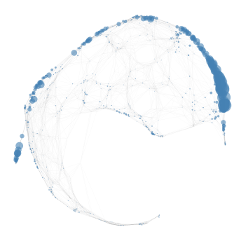
[14]:
GraphPlot of 1414 nodes
We can also visualize mapping score and cluster membership of cells simultaneously.
[15]:
nabo.GraphPlot(graph, vc_attr='cluster', vs=me_mapping_score)
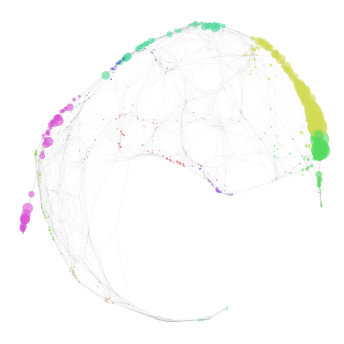
[15]:
GraphPlot of 1414 nodes
A list of reference cells with high mapping score can easily be obtained by supplying a cutoff value using the min_score parameter and setting sorted_names_only as True in the get_mapping_score method. This list will have names of reference in order of decreasing score, i.e the reference cell with highest mapping score will be the first cell in the list.
[16]:
high_score_ref_cells = graph.get_mapping_score('ME', min_score=5,
                                               sorted_names_only=True)
len(high_score_ref_cells)
[16]:
58
One crucial aspect of mapping is to test whether the target cells strongly mapped to a close group of reference cells or if they mapped all over the graph. calc_contiguous_spl calculates the mean of the shortest path length (the number of nodes that needs to be traversed before reaching from one node in the graph to another) among subsequent nodes provided in a list. Here we provide calc_contiguous_spl with the list of reference cells with high mapping score obtained above.
[17]:
graph.calc_contiguous_spl(high_score_ref_cells)
[17]:
3.5789473684210527
To put this into context, we can check the mean shortest path length:
[18]:
graph.calc_contiguous_spl(
    graph.get_random_nodes(len(high_score_ref_cells))
)
[18]:
8.31578947368421
When comparing the two numbers above it is clear that cells in high_score_ref_cells are much closer (3.6) to each other than randomly expected (8.05). It is to be noted, however, that this function is designed for mappings where target cells are expected to map largely to one cluster. If target cells are heterogeneous and expected to map to different parts/clusters of the reference graph then the result of calc_contiguous_spl will not
be meaningful.
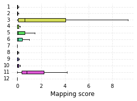
Let’s plot the distribution of mapping score for each cluster:
[19]:
me_cluster_score = graph.get_mapping_score('ME')
nabo.plot_cluster_scores(me_cluster_score, graph.clusters)
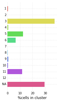
The classify_target method assigns each target cell in a given sample to a reference cluster. It is important that reference cells have each been assigned a cluster identity before calling this method. By default, this method will return a dictionary with predicted cluster for each target cell, but here we set ret_counts to True so that only number of cells classified to each cluster are returned. null_label is the label put on cells
that remained unassigned.
[20]:
target_cells_cluster = graph.classify_target('ME')
nabo.plot_target_class_counts(target_cells_cluster, graph.clusters, sort=False)
At the end we save the this Graph instance to a file. The information about reference graph layout and cluster information as well as data for any loaded target graph will be saved. More about how to load this graph in the next notebook in this tutorial.
[21]:
graph.save_graph('../analysis_data/hvg_graph.gml')